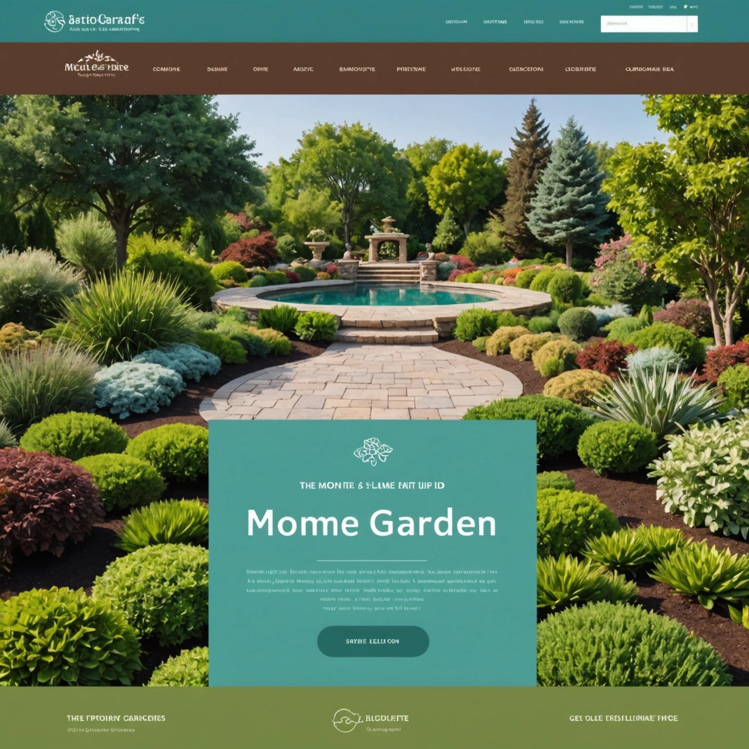
Are you looking to give your landscaping website a fresh and captivating look for 2024? At Galaxy Growth Media, we understand the power of an effective color scheme in making your online presence stand out. In this guide, we’re diving into the best color schemes for a landscaper website, ensuring your digital space radiates the professional and inviting atmosphere your business deserves.
From understanding how different colors impact user perception to discovering the winning color combinations for 2024, we’ve got you covered. Join us as we explore seasonal colors, the impact of accent hues, and how to seamlessly incorporate your branding into your website design. Ready to transform your website? Let’s get started!
Want free resources to grow your service business?
Join thousands of other business owners and get the best marketing tips and insights delivered straight to your inbox.
ENTER YOUR EMAIL BELOW:
What are the Most Effective Color Themes for a Landscaper Website?
Nature-Inspired Greens
Using a palette inspired by the various shades of green found in nature can create a serene and inviting atmosphere on a landscaper website. Greens symbolize growth, renewal, and the lushness of well-maintained gardens. Implementing various hues—from rich forest greens to lighter, more airy shades—can help to convey the depth and diversity of your landscaping services.
Earthy Neutrals
Earth tones such as browns, tans, and beiges are perfect for establishing a grounded and harmonious feel. These colors evoke the natural world and can help to highlight images of plants, soil, and outdoor environments. Earthy neutrals work well as background colors or as complements to bolder greens, creating a balanced and professional look.
Refreshing Blues
Blues are a great choice for adding a refreshing and calming influence to a landscaper website. They can remind users of water features, clear skies, and peaceful outdoor settings. Shades of blue, from sky blue to deep navy, can enhance the overall aesthetic appeal and imbue a sense of tranquility and trust.
Warm Earth Tones
Warm colors such as terracotta, rust, and golden yellows can inject a sense of warmth and comfort into the website. These colors are reminiscent of sunlight, autumn leaves, and blooming flowers, invoking feelings of optimism and energy. They can be used to highlight important sections, call-to-action buttons, or to accentuate green landscapes.
Bold Contrasts
For a more dynamic and modern look, consider using bold contrasts like dark greens paired with crisp whites, or deep blues against bright greens. These combinations can create a striking visual impact, helping different sections of the website stand out and making the content more readable. Bold contrasts can also direct users’ attention to key elements, such as promotions or contact information.
Subtle Pastels
Pastel colors, such as soft pinks, lavenders, and mint greens, can add an elegant and understated charm to a landscaper website. These hues have a fresh and airy quality that can make the website feel light and welcoming. Pastels are especially effective when used for accent elements or background shades, helping to create a sophisticated and appealing visual experience.
Next up, we’ll explore how different colors influence user perception on landscaper websites. For more insights on creating a visually appealing and effective website, check out Galaxy Growth Media’s website design tips.
How Do Different Colors Influence User Perception on Landscaper Websites?
Colors play a pivotal role in shaping user perception. They’re not just about aesthetics but also about evoking feelings and responses. For landscaper websites, the right color schemes can create a welcoming, trustworthy, and professional atmosphere.
Here’s how different colors can influence user perception on landscaper websites:
- Green: Often associated with nature, growth, and sustainability. It makes users feel serene and confident about the outdoor services being offered.
- Brown: Represents earthiness and stability. It can evoke feelings of reliability and groundedness, which are essential for cultivating trust.
- Blue: Conveys calmness and professionalism. It’s also linked to water elements in landscaping, making it a fitting choice for water feature services.
- Yellow: Brings forth energy and optimism. A touch of yellow can brighten up the aesthetic, making the site feel more welcoming and enthusiastic.
- White: Implies cleanliness and simplicity. A website with white space feels organized and easy to navigate, enhancing user experience.
- Dark colors (black, gray): Offer a sense of sophistication and modernity. They can be used sparingly to add depth and highlight key areas without overwhelming the design.
Leveraging these colors thoughtfully can help attract potential clients by making your landscaper website both visually appealing and psychologically impactful. For more insights on effective color schemes and design strategies, check out Galaxy Growth Media’s industry-specific recommendations. Up next, we’ll explore specific color combinations that work best for landscaper websites in 2024.
What Color Combinations Work Best for Landscaper Websites in 2024?
In 2024, landscaper websites are embracing color schemes that reflect both nature and modern design trends. The right combination of colors can captivate visitors and convey your brand’s message effectively. Here’s a look at some of the best color combinations to make your landscaping website stand out this year:
- Green and Brown: Representing nature and earth, this combination is a classic choice. Green evokes growth and sustainability, while brown adds a grounded, earthy feel.
- Blue and White: These colors together create a clean, fresh, and professional look. Blue symbolizes trust and expertise, while white adds clarity and simplicity.
- Yellow and Gray: A modern and vibrant combination. Yellow gives off energy and optimism, whereas gray offers balance and sophistication.
- Orange and Green: Perfect for a lively and energetic impression. Orange grabs attention with its warmth and friendliness, while green maintains a connection to nature.
- Beige and Forest Green: This combo offers a more muted, natural palette. Beige gives a sense of calmness and approachability, balanced beautifully by the depth of forest green.
These combinations aren’t just trendy—they’re also designed to appeal to the sensibilities of users looking for landscaping services. Choosing the right colors helps set the tone for your website, making it inviting and professional to prospective clients. For more insights on effective web design and marketing strategies, visit the Galaxy Growth Media blog.
How to Use Seasonal Colors to Enhance Your Landscaping Website
Spring: Fresh and Vibrant
Spring is all about renewal and new beginnings. Use colors like fresh greens, soft pinks, and yellows to evoke the blooming landscapes of the season. These colors create an energetic and inviting feel, perfect for showcasing your spring services and projects.
Summer: Bright and Energetic
Summer landscapes burst with life and color. Incorporate bold and bright hues like vibrant blues, sunny yellows, and rich greens. These lively colors can help capture the essence of summer gardens and lawns, making your website feel warm and welcoming.
Autumn: Warm and Cozy
Autumn is marked by falling leaves and rich, earthy tones. Utilize deep reds, oranges, and browns to reflect the changing foliage. These colors bring a sense of warmth and coziness, perfect for showcasing fall landscaping projects and services.
Winter: Crisp and Clean
Winter landscapes often feature a stark beauty. Use cool colors like icy blues, crisp whites, and muted grays to evoke the season’s calm and serene atmosphere. These colors can add a sense of sophistication and clarity to your website during the colder months.
Tips for Seamless Seasonal Transitions
Transitioning your website’s color scheme with the seasons doesn’t have to be complicated. Here are a few tips:
- Plan Ahead: Create a seasonal color palette for the entire year, so transitions are smooth and consistent.
- Use Accent Colors: Gradually introduce seasonal colors through accents, like buttons, banners, and headers, before fully committing to a new palette.
- Coordinate with Content: Align your seasonal color changes with relevant blog posts, promotions, and featured projects to maintain a cohesive look and feel.
- Monitor Performance: Track how each seasonal color scheme affects user engagement and adjust as needed to maximize effectiveness.
By thoughtfully integrating seasonal colors into your landscaping website, you can create a dynamic and engaging user experience that resonates with visitors all year round. For additional insights on enhancing your landscaping business’s online presence, consider exploring the benefits of local citations for Texas landscapers.
What Role Do Accent Colors Play in Landscaper Website Design?
Accent colors are a powerful tool in creating an inviting and effective landscaper website. They highlight key elements and guide user navigation—making your site not just visually appealing but also functional.
Used strategically, accent colors can evoke specific emotions and reinforce your brand identity. Here’s how they can enhance your landscaper website:
- Draw Attention: Accent colors highlight call-to-action buttons, ensuring they stand out and drive conversions.
- Create Hierarchy: They help organize content by drawing the eye to important sections like services or special offers.
- Enhance Readability: Proper use of accent colors can improve text readability, making it easier for visitors to engage with your content.
- Reinforce Branding: By aligning with your brand colors, accent colors contribute to a cohesive and professional look.
- Guide Navigation: Color-coded navigation elements help users easily find their way around your site.
- Set Mood: Specific hues can evoke calm, trust, or excitement—enhancing the overall user experience.
Understanding the role of accent colors in web design helps you create a site that’s both aesthetically pleasing and user-friendly. Up next, we’ll delve into how to incorporate branding colors into your landscaper website design. For more insights on optimizing your web presence, check out this guide on using local keywords effectively for SEO in Texas.
How to Incorporate Branding Colors into a Landscaper Website Design
Understand Your Brand Identity
Before incorporating colors, you need to understand your brand’s identity. What does your brand represent? Are you aiming for a sophisticated, luxury feel or a more approachable, earthy vibe? Knowing this will guide your color choices.
Choose a Primary Color
Your primary color should reflect your brand’s core message. For landscapers, greens and browns often work well because they relate directly to nature. This primary color will be the main color across your website, creating a unified look.
Select Complementary Colors
Complementary colors should enhance your primary color, not overshadow it. Think of neutral colors like beige, off-white, or soft grays. They provide contrast and make your primary color pop without overwhelming your design.
Incorporate Colors Consistently
Consistency is key. Use your chosen colors across various elements: headers, buttons, backgrounds, and even text highlights. This creates a cohesive, professional look, making your site easy to navigate.
Consider the Emotional Impact
Colors evoke emotions. Green can feel refreshing and calming, while brown can give a sense of stability and reliability. Choose colors that align with the emotions you want your visitors to feel when they visit your site. For more insights on enhancing your website’s appeal, check out these strategies for managing online reviews.
Test Your Color Scheme
Before finalizing, test your color scheme on different devices and under various lighting conditions. What looks great on a computer screen might not translate well to a mobile device. Make sure your colors are accessible and visually appealing everywhere.
Conclusion
Choosing the best color schemes for a landscaper website is essential to creating a captivating and professional online presence. By utilizing harmonious color palettes, you can effectively highlight your services, attract potential clients, and enhance user experience. Thoughtful color selection not only aligns with your branding but also communicates trust and reliability to visitors.
At Galaxy Growth Media, we specialize in crafting visually stunning and effective websites tailored to your business needs. Whether you’re in The Woodlands, Spring, Conroe, Tomball, Kingwood, or Lubbock, our team is ready to transform your digital presence. Contact David Martirosian at 917-364-6832 or email us at dmartirosian@galaxygrowthmedia.com to get started on your next web design project.
Quick Links